Before starting the shoot, we did our actor, Tanu’s, makeup, hair and finalized her outfit. For her makeup, we decided to do a heavy eyeshadow look with a red lipstick, this was look was inspired by RAYE’s look in her music video, Escapism. The heavy eyeshadow connotes the emotional turmoil that she is going through. We specifically chose red lipstick because it connotes self confidence and we wanted to show the audience that despite her going through a rough time she is still confident. As for her hair, we decided to keep her natural frizzy and wavy hair. This is because, it would give the video a sense of realism/verisimilitude. The outfit that we finalized was a black dress with black shoes. This simple outfit balance out the heavy makeup look.

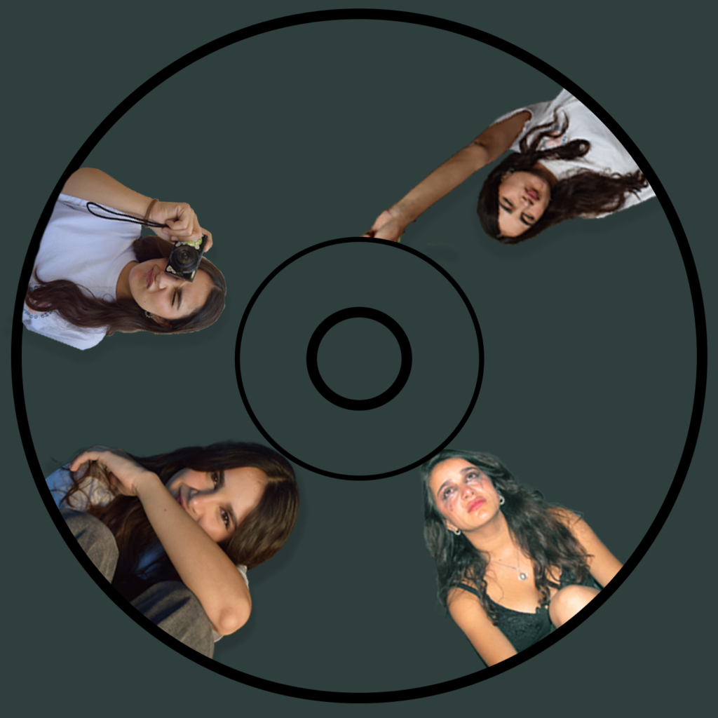
After doing Tanu’s makeup, we started with a photoshoot with the extra character for our digipak. We shot using our Canon camera for high quality images and tried different angles so that we would have multiple images for both our digipak and our social media page. We chose to shoot in front of a dark green background because it provides a strong contrast between the individuals and the background, which helps to make our actors stand out and grab the audience’s attention. The contrast can also helps enhance the actors facial expressions.
 After the photoshoot we decided to start shooting our first scene where the camera was on the tripod and the character was positioned in the center of the frame which helps to grab the audience’s attention directly on the actor, eliminating any other distractions. This shot however, has not been used in the final product because it does not match the police lineup photography background. The background we used was not white and the lines weren’t black which made it less realistic, hence, we decided to reshoot using a white background with black lines.
In this scene, I used top angle to create a dramatic and intense visual effect. I chose to use top angle because it helps to emphasise isolation that the character is feeling and this is exactly what we wanted because in this scene the character is speaking to herself about certain decisions that she could make and the potential action after that.

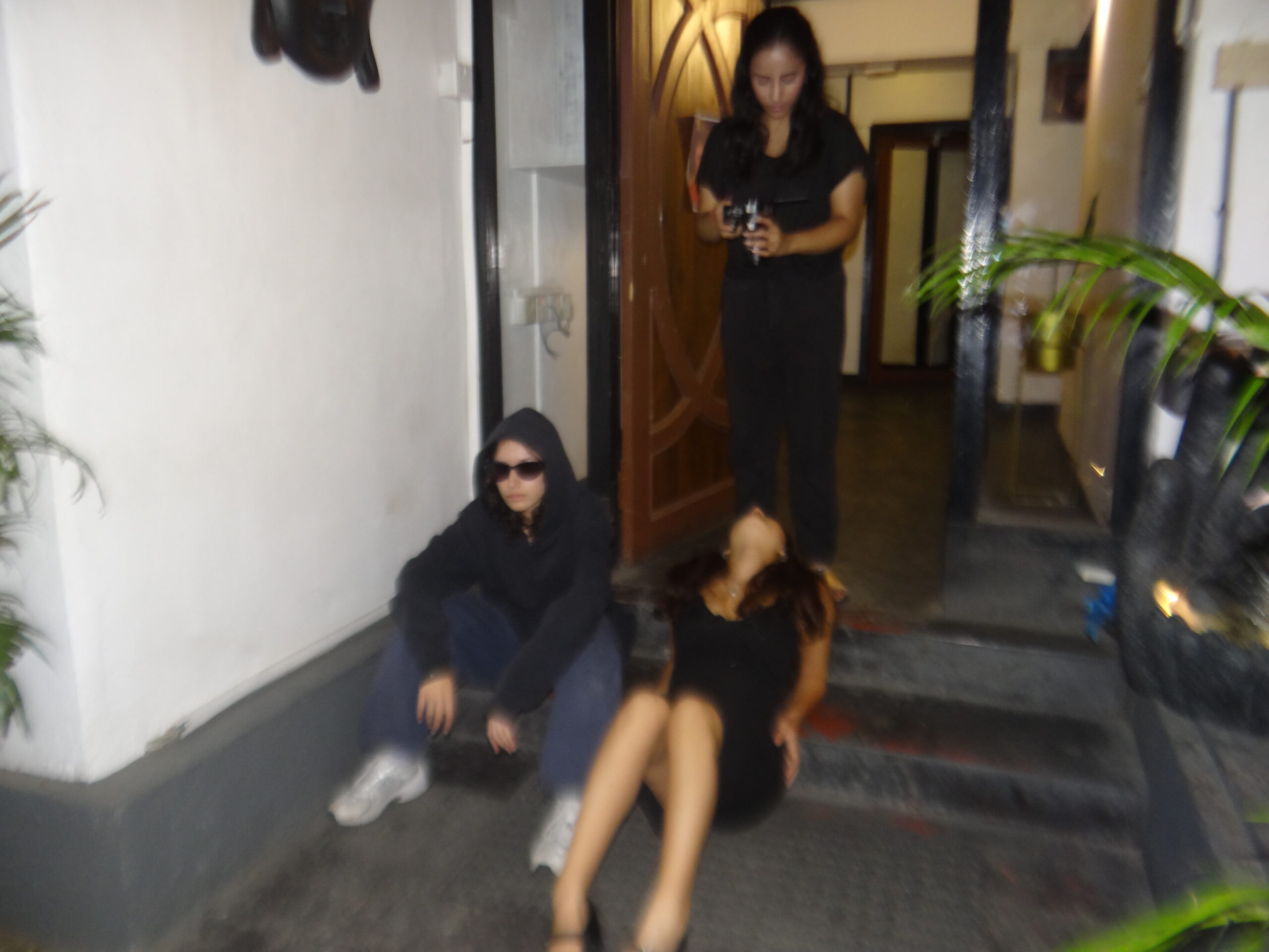
 For this scene we shot outside using natural lighting. I chose not to use any extra lighting because it introduces dynamic lighting condition which creates interesting shadows and highlights that add depth to the scene. The outdoor location can also connote liberation. The open and unrestricted outdoor location can signify personal growth and discovery which aligns what our actor is going through in this specific scene


 For this scene, I had to figure out how to show the TV being smashed without putting myself or the actor in danger. I used different angles and movements to make it look like the actor was right there while keeping them at a safe distance. In order to do so, I used low angle shot, profile shot and restricted pan movements.