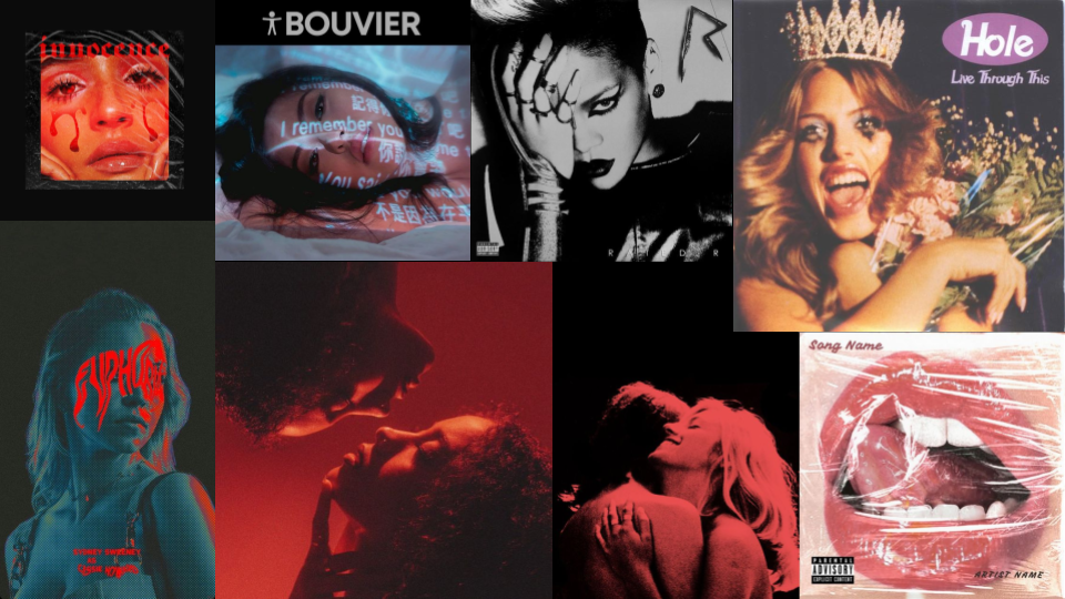
Pre Production
Before we started to officially film our music video, we did a few test shots to see how our ideas would look on a camera.
Digipak Analysis
Rated R by Rihanna
Image: The costume that she is wearing in this image is very provocative and strikes a bold and confident pose. Her style matches the albums theme of edgy and bold. This image also looks like a paparazzi shot because of the flash that is used. Her facial expression signify that she is not happy with her picture getting taken. This also highlighted that taking the picture was an invasion of her privacy, reflecting how easily accessible celebrities’ lives have become. Due to modern technology, their privacy is significantly reduced. This image can also be interpreted through Judith Butler’s theory of gender performativity, where she argues that gender performed and constructed through repetitive actions, behaviors, and expressions. This aligns with the image because of the way the media sexualises female body and it can be seen in this image as well.
Lighting: The lighting in this image is very low key which creates a sense of moody/intimate atmosphere. It also connotes the vulnerability amd mystery that comes with being a celebrity and often being followed by exposure or the sense of losing ones privacy.
Costume: The lingerie and the fur coast connote a mix of luxury and fragility/insecurity. Whereas, the heels and stocking traditional symbols of femininity.
Color scheme: This side of the digipak does not follow the color scheme of the overall monochromatic theme which
Text: This side of the digipak has all the track lists along with the names of the producers.
Branding: One key element of branding in this image is Rihanna herself. Her identity and persona is a huge brand in itself. This image promotes her brand as bold, unapologetic and an empowered figure. David Gauntlett’s theory of identity can be applied here as he said that the audience finds/ recognises a part of themself through the media or a media a figure. Rihanna’s brand here sends a message of female empowerment and sexuality.
Typography: The edgy font matches with the theme of the overall cover which is bold, edgy and somewhat gothic.
Photography: This picture has been taken using a close up shot which positions the audience to confront the raw emotions and vulnerability that the album explores. The direct eye contact allows the audience to engage on a personal level, almost challenging them to listen into the music.
Representation: Rihanna goes against Laura Mulvey’s theory of male gaze, her gaze confronts the viewer, challenging them to see her as a person with power and depth, rather than merely a spectacle. Hooks argues that true empowerment comes from resisting the societal pressures to conform to a single, limiting idea of femininity. Rihanna’s portrayal on the cover aligns with this idea by presenting a more nuanced and authentic image of a woman who is strong precisely because she embraces her vulnerability
Monochromatic Color Scheme: The black-and-white palette also adds a timeless, classic quality to the image, while the sharp contrasts between light and shadow create a dramatic, almost cinematic effect. The monochromatic scheme emphasises the seriousness and the darkness of the album.
Lighting and Shadow: The lighting in the photograph is harsh and directional, creating deep shadows that enhance the album’s dark and edgy aesthetic. The use of chiaroscuro not only adds drama to the image but also symbolizes the internal struggles and resilience.
Symbolism: The act of covering one eye can symbolize shielding oneself, hiding emotions, or seeing things in a distorted or partial way. We can see that she is wearing a metal claw ring, which could connote a defensive attitude. We can tell the theme of this album, empowerment and disobedience, by the song titles; “Fire bomb” “Russian Roulette” “Rude boy” etc…. This also matches the albums theme of empowerment and disobedience. The symbol of the album looks similar to a movie rating which plays on the concept of censorship and restriction, connoting that this album is raw, unfiltered and targeted for mature audience.
Color scheme: The disk itself follows the overall color pallette of the digipak.
Branding: The audience can immediately connect the letter R to Rihanna because of her brand identity. Its bold and rough design can be directly connected to her image as a powerful, fearless and influential figure.
Typography: The typography of this letter matches the theme of the album. The “R” appears to have been scratched on to the disc which connotes strength or even edginess which is equivalent to her public figure as a bold artist who challenges traditional conventions.
Representation: The sharp and rough way that the R has been written on the disc also challenges the stereotypical view of femininity. She challenges the typical expectation of women in the industry by showing visuals that highlight independence.
Live Through This by Hole
Representation: In this digipak we can see that Hole, the artist, challenges traditional representation of femininity by the use of visual elements such as the smudged makeup which challenges traditional societal norms and expectations of women where they have to look presentable and well composed. By doing this Hole challenges the fact that femininity is only linked to physical appearance. Furthermore, she also challenges Laura Mulvey’s Theory of Male Gaze which says that women are objectified and viewed in a way that highlights their physical appearance. However, in this image Hole opposes this by opting for a messy and rebellious look which also reinforces the fact that women are more than just their beauty. Moreover, the destruction of flowers, which normally connotes purity and beauty, emphasises the rejection of societal expectations to fit woman into narrow roles of beauty and behaviour.
Mise-en-scene: The mise en scene used in this image connotes. rebellion and anger. The tirara, heavy makeup and flowers are symbols of beauty pageant which connotes how females should look like. However, the contrast between these symbols and the makeup along with the wide open mouth creates a sense of chaos which also signify the pressures of being an “ideal female figure.” Furthermore, the wide open mouth can also connote anger or possible relief that she feels. Stuart Hall’s Encoding and Decoding Theory can be applied here, where the image encodes a message of breakdown of the beauty queen but the audience could decode it as rebellion, anger or tragic.
Color Palette: The colors used in this digipak is very warm and have a very retro feel to it which could reference the traditional ideal of the beauty queen from an earlier era. But, this contrasts with the angry/chaotic image which could connote a clash between traditional/ old fashion ideas of femininity and new modern feminist critique.
Image: This image contrast the front cover. This is because the first image was more about facing the harsh realities of the world whereas, this image is more about the innocence and purity of childhood. This is an juxtaposition between the two pictures connoting the drastic difference childhood and adulthood.
Mise-en-scene: Mise en scene has been used to create meaning. The muted color of the background and the child’s’ outfit signify a sense of vulnerability. Furthermore, the girl is dressed in an oversized flannel shirt which breaks the representation of young femininity. This is because in the mainstream media, young girl’s are often seen wearing dresses which people consider conventionally “girly” however, this image challenges this. Stuart Hall’s theory of negotiation can be applied here. This theory states that audiences are active participants who bring their own experiences, values, and perspectives to their interactions with media. In this image, some may see this as a symbol of innocence whilst some may interpret it as how societal pressure and expectation influence young girls .
Text: This side of the digipak has all the track lists. It looks like the texts are designed to look like stickers, which creates a sense of childlike creativity. By doing something a child would do the digipak connects to the albums overall theme of the innocence and transition to adulthood.
Semiotics: The heart shape which is normally linked to love, affection and vulnerability juxtaposed with the band name, Hole, which creates a sense of loneliness and pain. Doing this connotes that even love can be painful. The circular shape of the CD with a heart shape also connotes that something is cyclical or recurring like heartbreak, pain or struggles. It could also reflect on the cycle of life.
Text: The title of the songs have been placed on the circumference of the CD which creates a visual balance and draws the viewer’s eye around the entire of the design.
Rebel Heart by Madonna
Color Pallette: The use of black and white in this image helps shift the viewers attentions to Madonna’s facial expression and the cord wrapped around her face. The simplicity of the black and white intensifies the emotional impact and it emphasizes her facial features. Furthermore, it also creates a sense of timelessness which matches her iconic and classic image. Usually in pop culture black and white is used to connote raw or authentic look because it removes the glamour that is associated with colors. By choosing to use black and white colors Madonna suggests a sense of vulnerability and connotes that she’s moving away from the flashy image that celebrities have to show a deeper and real side of herself, which also matches with the theme of album – personal struggle.
Mise en scene: Mise en scene is used to suggest themes of rebellion, strength and resilience. This lighting used here is high contrast which enhance the features of her face and also produces an area of darkness at the edges. This also sets up a more confrontational type of relationship.Madonna’s look at the audience is very powerful and determined, it points to confidence.’ attentions to Madonna’s facial expression and the cord wrapped around her face. The black and white effect strengthens the emotional impact and it highlights her facial features. Madonna’s intense, direct gaze at the viewer suggests strength and self assurance. The expression serves as a form of non verbal communication which matches with the albums theme. Her look is confrontational as if she is challenging the audience to meet her on her terms suggesting that she’s breaking away from traditional expectations. Using Barthes’ semiotic theory we can interpret the black cord as a symbolic sign of restriction or control which suggests that she feels constrained or trapped, possibly due to societal expectations. Nevertheless. her intense gaze and firm expression connotes that she’s resisting these constraints. The use of this cord brings out the rebel aspect of the album, showing that she’s fighting against being tied down. According to Richard Dyers’ star theory, stars are carefully constructed and controlled by a combination of their own performances, media representation and the influence of various professionals for example, agents, stylists and publicists, to appeal to specific target audiences. Madonna’s rebel image in Rebel heart is not just based on her personality but is created through intentional styling and symbolism. The tattoo like writing of the album name on her neck gives the music a rebellious feel which is a permanent mark, which shows that her rebel is a permanent part of her.
Representation: Madonna has been historically known to represent female empowerment with this cover she continued to do so by challenging the audience with an image that isn’t so glamourous or traditionally feminine. Rather, she appears powerful yet trapped.
We can apply Stuart Halls audience theory here where the cover can be interpreted in many ways by different viewers. A dominant reading interpret Madonna as powerful, relating with fans who see her as a symbol of independence and strength. An oppositional reading might depict the cords as a negative symbol, connoting that she is trapped by fame or societal expectations. A negotiated reading could acknowledge both perspectives, seeing Madonna as both empowered and challenged by her own image.
Mise en scene: Mise en scene is used in this side of the digipak to reinforce the theme of love and rebellion. The use of this striking red suggests passion, anger or love. The deep red background also makes the heart look intense and dramatic. Her red nails seamlessly blends with the background and the heart that she is holding. It is almost as if they are part of the same whole. The strong grip that she is holding the heart with suggests that she is in control of it. This also connotes her strength in owning her emotional and personal life, suggesting that she won’t let anyone else have authority over her heart or feelings. The choice of using a realistic heart and not a cartoon heart suggests rawness and authenticity. This realism connotes that in this album Madonna is showing her true self. It also challenges the audience to confront the real, sometimes the hard side of emotional experiences, which opposes with the sharply with typical portrayals of femininity in pop culture. The phrase “wearing my heart on my sleeve” has been taken literally here, holding a bleeding heart in her hand, she is making a bold statement about her emotional honesty, she’s showing her vulnerability openly.
Typography: Madonna has been written in a cursive, tattoo like way which connotes rawness. It adds a personal touch and intimacy this is because, by doing so she reinforces the idea that, Madonna herself “owns” this branding, rather than it being a polished or manufactured label. The black ink against the red background also makes the writing stand out due to the contrasting colors.
Photography: The use of a close up shot creates a sense of focus, leaving little space for distraction from the striking image of the heart. The background and the heart is almost entirely red. The light used here creates the powerfully deep red color, which connotes passion. The image is a combination of reds with some black-and-white strokes only and that is why the heart has a powerful intensity, and the audience pays attention to it.
Typography: The hand written style of “Rebel Heart” adds a personal touch to the digipak and it makes the text look unique. It could connote Madonna’s’ rejection to traditional sophisticated fonts/typography.
Colour: The use of red connotes anger, passion or danger. The white contrasts with the black background and the strip of red. This could have been done to highlight the title of the album. The white could also connote purity, resilience or strength which can reflects her message of staying resilient and strong during challenging phases of life.
Music Video Analysis
Escapism by RAYE
https://www.youtube.com/watch?v=Dll6VJ2C7wo
Mise en scene has been used in this music video to connote RAYE’s emotional and mental state. In the first scene, we can see RAYE running through the streets which could connote her running away from her problems. The black and white filter makes the scene look more intense and it connotes sadeness or isolation. Her costume throughout the video is the same, a provocative dress, long boots, gloves, heavy jewellery, very heavy makeup and messy hairstyle . This costume can suggest that she is dressing up to hide her vulnerabilities or to make her feel good/confident. However, her unpolished makeup and messy hairstyle can be interpreted as a subtle hint of how she is really feeling internally. The gloves that she can be seen wearing can connote a barrier/protection, something that stops direct contact or it could connote detachment. The music video often shifts from 2 primary locations, one, a lively nightclub with a lot of people or a dark and empty alleyway. The nightclub can suggest a way for her to escape her pain and emotions and the alleyway can suggest how she is actually feeling inside, empty. Often use of confined spaces like the nightclub can suggest how she is feeling trapped by self destructive behaviour. The lighting used in the video is mostly intense colors like red and blue. The use of red light could connote how the attempts she makes to numb her pain is dangerous. The blue light could connote the sadness or isolation she feels internally. The lighting is dim and a lot of shadows can be seen which gives the video a moody and dark aesthetic. Props that are used in the video include cigarettes, alcohol/drinks etc… which symbolises the coping mechanisms she uses are harmful to her.
It may be engaging to both men and women. However, it may be more appealing/ relatable to women because of RAYE’s experiences and how she challenges traditional feminine stereotypes.
RAYE rejects the traditional use of linear narrative for the video, rather, she opts for narrative fragmentation. The use of fragmented narrative could also suggest that her mental health is not stable and that she is struggling with it. This media text can be considered as postmodern text as it uses fragmented narrative.
Laura Mulvey’s theory of the male gaze states that in media texts women are often shown as objects of visual pleasure. However, in this music video RAYE’s representation goes against this theory. Her messy look, emotional vulnerability shifts the focus from external beauty to internal struggle which challenges traditional portrayals of women in the pop genre. Barthes theory of semiotics distinguished between denotation (the literal meaning of a sign) and connotation (the cultural and emotional associations attached to it). He argued that connotations often reinforce dominant cultural ideologies. In this music video, Alcohol and Substances act as denotation and connotations. They are featured as symbols of satisfaction and temporary relief which reflects the music video’s destructive nature. Their denotation could be visible use of alcohol and reckless behavior which connotes a sense of realism, while the connotation argues for the glamorized representation of such things in pop culture. Rather than celebrating this, the darker portrayal highlights its emptiness and negative consequences. RAYE’s messed up makeup look and scruffy appearance could represent a lack of control and emotional vulnerability. This imagery isn’t the traditional polished, idealized representation of women who are often seen in pop music videos, highlighting the true and unfiltered reality of emotions. These elements create a narrative which challenges traditional genre norms.
A hand-held camera has been used quite a lot in this music video. This could have been done to represent how RAYE is feeling internally, lost, unstable and confused or it could have been used to create a sense of verisimilitude which also helps the audience to connect with the video/artist. Close up shots have also been used. This type of shot could have been used to show/capture RAYEs her vulnerable moments or to show the raw feeling that she may have felt such as fear. This type of shot also helps build a personal connection with the audience. Tracking shots have been used to show her isolation despite being in a busy city. Nonlinear editing is used through the use of flashbacks, which connotes that RAYE is lost in these memories and never going to get out. This, too, follows the postmodern, nonlinear storyline. Furthermore, slow-motion cuts moments add emphasis, and focus on RAYE’s mental health.
The video positions the audience to empathize with RAYE’s emotional struggles by letting them in her vulnerable and chaotic experiences. This lets them relate to RAYE as an authentic and relatable person, especially viewers who have experienced emotional distress or have had to use escapism as a coping mechanism. Themes of heartbreak, addiction, and escapism are understood by the audience which makes the video emotionally appealing across a broad audience. Younger audiences especially may see their own struggles reflected in RAYE’s story which creates a deep personal connection. The video targets younger audiences, particularly people from the age of 16 to 30, who are likely to relate with the themes of the music video (emotional struggles, nightlife culture, and self-discovery.)
Look What You Made Me Do by Taylor Swift
https://www.youtube.com/watch?v=3tmd-ClpJxA
The first scene, where Taylor Swift can be seen coming out of a grave, can metaphorically connote that she is bringing out a new version of herself. She can also be seen burying herself which connotes that she is burying her past image. Furthermore, this could suggest a symbolic act of freeing herself of the image that the media has created of her. This connotes rebirth or empowerment. In the scene, where she can be seen sitting on a throne, surrounded by snakes can suggest the power and authority that her new identity holds. The snake is a symbol of negativity that can be associated with Taylors public feuds. By accepting and using the same symbols that were once used to criticise her. She takes control of the story by turning the snakes into a sign of her ability to rise above negativity and show her power. In one of the scenes of the music video she plays with the idea of being watched and judged. This can be seen where she is surrounded by paparazzi/cameras whilst her car is on fire. This connotes how female celebrities are always being watched by the media and the public, everytime they do anything it is documented and criticised.
Throughout the video, she wears many costumes which symbolises the different versions of herself throughout her career: the “innocent” country girl, the glamorous pop star, the rebellious rock figure. Each of these costumes connotes a chapter in her career that the media has often defined for her. Furthermore, the costumes she wears look very luxurious and expensive which contrasts her old image of being innocent. By literally embodying these different images of herself, she critiques the way her identity has been fragmented by the public. In the scene where she is sitting on a throne, she can be seen wearing jewellery that resembles snakes which is another way in which reinforces her control and power.
In the first few scenes, the lighting used is low key with heavy shadows and sharp contrast. This connotes a sense of enigma because the darkness and shadows hides certain details which makes the audience unsure about what they are seeing. It also aligns with the theme of revenge. The use of low key lighting also helps set up her transformation, clearly showing the shift from her old lighthearted public persona to an empowered and powerful woman. Most colours that have been used in this video are dark red, black and gold. These colours usually represent power, danger and wealth which strengthens the theme of control and dominance. However, in the scenes where she has dressed up as her “old self” she has used bright and pastel colours which connotes her simplicity and innocence. The contrast between these old Taylor and new Taylor shows the shift in her power dynamic.
The pacing of the editing in this music video varies from scene to scene. In the scene where Taylor is robbing the bank we can see that there are very quick cuts which builds suspense for the audience, helps to involve them and reflects the chaotic nature of the video. However, in the scene where she can be sitting on a throne surrounded by snakes there are very long shots with few edits. This has been done to show her authority. The transitions in the music video are also very seamless and smooth, it helps the video to move from one setting to another. For example, in the first scene, a graphic match cut has been used which Smooths out the transition between shots and different periods in time. Moreover, wipe transitions have also been used which has the connotation of theatre curtains opening
Tracking shots are very frequently used to create a sense of energy which also enhances the chaotic tone of the video. An example of this is when she’s robbing the vault. Slow pans are used in more of a controlled moment like when she is on top of the human pyramid of “old taylors” (2:25) using this type of camera movement helps to highlight her control and dominance. Low angle shots have also been used to give Taylor a powerful and commanding presence. This has been done when she’s sitting on the throne and when she is on top of “old taylors” The low angle also makes her look larger and more authoritative which connotes her dominance over the public perception. Shallow depth of field has been utilised in the scene where she is in the bathtub full of diamonds and gold (0:40). The blurring of the background draws the audience’s attention to her subtle facial expressions. This technique emphasises her detachment from materialistic wealth and highlights how emotionally isolated she feels despite being surrounded by luxury.
The first scene is set in a graveyard surrounded by headstones with her name on it which connotes the death of her past images set by the media/public. It is also a way in which she is introducing her new identity. There is an intertextual link to Michael Jackson’s Thriller music video, where he walks through a graveyard and turns into a zombie which further emphasises the rebirth of a new self. In Thriller, the zombie transformation connotes a transition into something more powerful yet darker, much like Taylor Swift’s rebirth in her video. Both of them use the graveyard as a metaphor for killing their past and embracing new and more empowered identities The headstones are marked with names such as “Old Taylor” which connotes the death of her old self. In the second scene, she can be seen in a luxurious mansion which signifies wealth and power; this also connotes the extent of her success. In the scene where she is inside a cage connotes being trapped by fame or public scrutiny. The cage being golden signifies that even with money and power life can be prison-like and suffocating. She is sitting on a swing inside the cage which connotes that she felt like she had restricted freedom.
In traditional music videos we see that the artist is glamorous, confident and idealised. However, in this music video we can see Taylor subverts from this and is accepting and owning up to her own flaws. In this video she can be seen as a zombie, a bank robber and all of her old personas which highlight the critical and sometimes negative public perception of her. Instead of presenting herself as perfect, she embraces and makes fun of the negative images that have been associated with her in the media. Furthermore, pop music videos often use bright colours to compliment its catchy, danceable songs. But, this video does not do so. Instead, it adopts a darker lighting, gothic themes and symbols of revenge which challenges the “normal” tone found in music videos. Steve Neale’s theory of repetition and difference suggests that genres rely on a balance of repetition and difference. Filmmakers use familiar elements (repetition) while introducing new twists or changes (difference) to keep the audience engaged. This theory can be applied to the music video because she introduces “difference” by showing herself in unattractive roles, such as the zombie, which is not a common representation of a pop star. Moving away from the glamorous, idealised identity creates mystery and originality, which helps to keep the audience engaged. Furthermore, pop music videos traditionally use bright colours to complement their catchy, danceable songs, but she contrasts this with darker tones and imagery, adding layers of irony and self-awareness.
Stuart Hall said that the dominant groups in society control those who are less powerful through something called Hegemonic power and stereotyping plays a role in that. In music videos, this often means that artists are portrayed in such a way that they look flawless. However, in this music video Taylor Swift goes against it and instead mocks the criticism she receives.
Scars Till Your Beautiful by Alessia Cara
As part of my research into music videos I discovered Alessia Cara’s video for “Scars till you’re beautiful”. The video is an interesting mix of traditional music video conventions identified and described by Andrew Goodwin, such as using performance and concept elements to communicate the meaning of the piece. Cara is shown in a post industrial warehouse setting, lip synching to the song, unusually however the performance elements are intercut with documentary sequences where the video connotes a diverse array of real people who discuss to camera the prejudices they’ve faced by being perceived as different. I like this technique of using documentary elements in the video and this is something I could experiment with in mine. Judith Butler’s gender performativity theory is an interesting idea that seems relevant to my analysis of the video. Amongst those represented in the video are transexual people, which highlights Butler’s theory that gender is fluid and learned or constructed as we grow depending on the social messages, ideology and pressure we have around us, rather than being a fixed innate biologically given element of our identity. The use of underrepresented and marginalised people in the video is also interesting because it is then possible for them to be positive role models for others like them in society. David Gauntlett wrote about this in his theory of Identity, where he maintained that diversity of representations in the media is important precisely for this reason.
The main focus of the music video is the stories of different people who share personal stories of overcoming societal pressure and self-acceptance, which aligns with Steve Neale’s genre theory that genres are defined by both repetition and variation. The video follows pop music video conventions by focusing on relatable, real-life people, a common theme that relates with the audience on an emotional level. It is also different to mainstream music videos because it introduces a documentary-style interview, where a person speaks directly to the camera, sharing their experience in an interview-like way, and is shot using close ups and medium close ups, this can also be seen in the music video itself. This approach doesn’t follow the traditional performance-driven pop videos which allows the narrative to take the audience’s focus and deepens the music video’s message of social acceptance and resilience.
Unlike typical pop videos that often centre around the artist’s performance with detailed choreography and high-concept visuals, this video uses a documentary-style approach. This shift away from “normal” representations which is commonly seen in pop videos helps to highlight the importance of self-acceptance and it presents a more inclusive and relatable narrative.
The aesthetics of the video helps to highlight the importance of the individual’s stories. This is because, rather than focusing on superficial visuals or special effects the video is very minimalistic. It has a very plain and simple setting and uses a high key light which is opposite to documentary aesthetics, this further challenges the conventions of visually extravagant productions. Furthermore, Alessia Cara’s presence is very understated which moves the audience’s focus on the main message of the video rather than her performance. This yet again challenges the traditional codes and conventions of traditional music videos which makes it stand out in a genre that often prioritises style of substance.
Moreover, Alessia Clara goes against Dominic Strinatis theory. This is because he argues that postmodern media prioritizes aesthetic over deeper meaning and creates products that are aesthetically appealing but lack substance. However, in this music video she shifts the focus of the audience away from her personal image and emphasizes people’s real stories and struggles that they have faced.
Usually, pop genre music videos often use models and actors that are idealised and glamorous with conventional beauty features. However, this music video showcases a diverse range of individuals with different body types, skin colours, and ages. For example, it includes people with visible scars, varied body sizes, and non-traditional beauty features. This representation directly confronts and challenges the typical media portrayal of beauty, which often excludes or marginalises such diversity. Pop music videos usually have high-energy choreography, flashy outfits, and grand settings. However, this video avoids these typical conventions by focusing on personal stories and emotional depth rather than flashy visuals or dance routines. The simple, intimate settings and the absence of elaborate costumes shift the focus from entertainment to a meaningful social message, showing a significant difference from typical pop video expectations.
The video uses soft but cold, natural lighting which connotes a sense of marginalization by the society. This lighting choice could also suggest the harsh reality that people have to face about their appearance. The people in the video are dressed in casual, everyday clothing, wearing minimal makeup. This choice reflects the video’s message that beauty doesn’t need to be enhanced or exaggerated, it’s something that exists naturally in everyone. Furthermore, the singer is seen wearing a full black costume which would suggest rebelling against the society’s norms.
The music video often uses close-up shots of the actors featured and captures their facial expressions in close detail. These close-ups are effective in conveying the genuine emotions of the individuals, be it their suffering, strength, or embracing themselves. By focusing closely on their faces, the video creates a personal connection between the audience and the individuals which highlights the theme of inner beauty and self-worth. We can also see that the video has been shot in a documentary style, where other than the singer, people can be seen sharing their stories.
The editing in the video is slow-paced which lets the audience have time to absorb the emotions and messages being shown. This slower rhythm matches with the song’s nature and helps highlight the importance of each individual’s story.
The video positions the audience to empathise with the actors by showcasing their personal struggles and moments of self-acceptance. The music video targets a broad audience by featuring individuals from diverse backgrounds and by the usage of different technical elements such as mise en scene. The video’s focus on self-acceptance and challenging beauty standards is particularly appealing to younger audiences (teenagers), who are often navigating issues related to self-image and societal pressures.
Planning
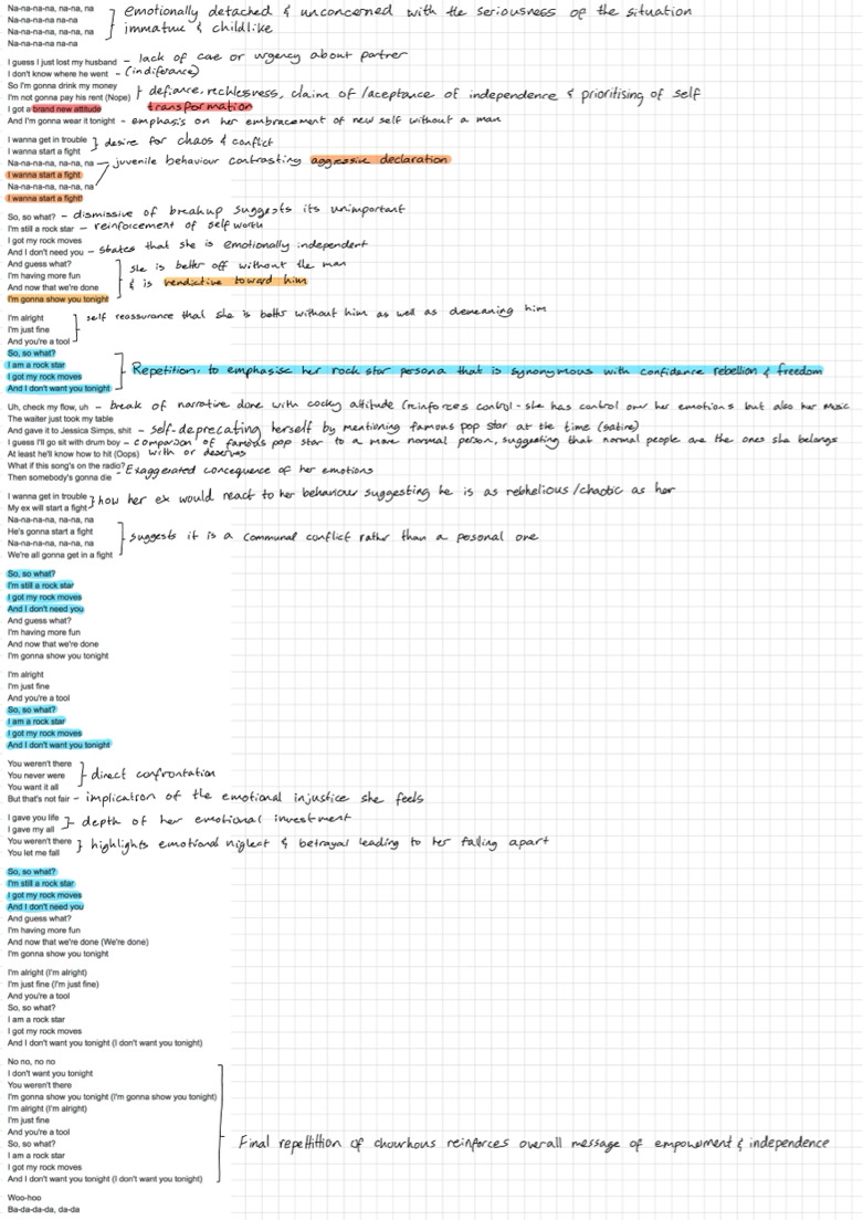
Before making a storyboard my partner and I analysed the song lyrics. We found that this song is much more than it’s catchy tunes, fun lyrics and a break-up anthem. It blends humour, disobedience, emotional complexity. The song criticizes societal norms and expectation put on woman and focuses on empowerment through expressing vulnerable emotions to her audience and she rejects the submissive potrayal of women.
Notes
- Demonstrated strong acting skills with a convincing portrayal of the character.
- Emotions were effectively conveyed.
- Height was suited for the role.
- Showed very good body language.
- Performance appeared slightly stiff. The facial appearance of the actor does not match what we are looking for.
- Emotions conveyed felt very flat.
- She did not connect to the character which made her look unconfident/hesitant.
- There was minimal use of body language.
- The actor did not seem confident in her performance.
- She lacked facial emotions and body language.
- Lacked variety in facial emotions, made it difficult to connect with the character.
- Moments where the character was dropped too quickly, affected the overall flow
- Performance was overly exaggerated.
- She doesn’t look mature enough
- Demonstrated potential for supporting roles.
- Mateo showed decent expressions which relatively matched the song.
- His height is not what we are looking for.
- He does not look mature.
- The expression portrayed by Anandi was incredible.
- Her appearance is young which does not match our expectations
- Her height is shorter than what we want
Recce Report
Production working title | A2 music video |
Sheet # | 1 |
Date | 9th September 2024 |
Location type |
Restaurant |
Address |
Warehouse, lalitpur, nepal |
Contact if permission needed |
n/a |
Transport to location |
Car |
Distance from school |
1.4 Km |
Power outlets |
8 |
Potential issues when filming |
Power cuts |
|
|
|
|
|
|
Risk Assesement
Risk | Who is at risk? | What can be done to avoid the risk? | Is the risk high, medium or low? |
Trip while walking on steps
| Cast and crew | Look and walk | medium |
Car accident | cast and crew | Make sure drivers are insured and tell everyone to wear seatbelts | medium |
Lighting stand may fall | Cast and crew | tape/ secure equipment on to floor | Low |
Broken solid sugar may hurt someone
| cast and crew | wear proper gear before shooting the scene | high |
Long shooting hours can cause tiredness/ fatigue | cast and crew | take breaks, eat and hydrate | medium |
Earthquake | Cast and Crew |
| medium |
Fire | Cast and Crew | keep fire extinguisher nearby | low |